ShopDreamUp AI ArtDreamUp

Deviation Actions


Suggested Collections


You Might Like…


Featured in Groups
Description
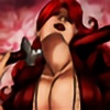
Just a little teaser image for my re-vamped "her" comic (name is still up in the air as of now)
This was supposed to be a pin up type image done in a sin city type style (how my comic may be done ) .
Hope your all looking forward to it ill have the first page & cover up hopefully in the first week of the year .
This was supposed to be a pin up type image done in a sin city type style (how my comic may be done ) .
Hope your all looking forward to it ill have the first page & cover up hopefully in the first week of the year .
Image size
1615x2102px 554.38 KB
Comments14
Join the community to add your comment. Already a deviant? Log In